Our NetSuite guides are designed to provide hints and tips to make our customers’ lives easier with regards to the use of NetSuite – here we focus on making sure you haven’t missed any of the key UI enhancements that were added during the most recent update.
As I’m sure you’re all aware, NetSuite’s Version 2014 Release 2 brought with it a new, more modern visual design. Based on customer feedback, NetSuite has improved key areas of the user interface including readability, navigation, data entry, and dashboard setup.
What’s changed?
Several changes have been made to the UI. One of the most noticeable changes, other than the brighter colours and larger fonts, is the use of progressive disclosure. This means that the elements you see on a page are reduced to the most important content. When you move your cursor over areas of the page, the links, menus, and icons that are appropriate for that area appear, so you can view more info if needed. The reduced clutter also makes it easier to display NetSuite data on touch devices.
Here we take you through the other key changes:
Header and navigation menu
The pages scroll as before, but the header and navigation menu remain fixed at the top to make them accessible at all times, even when you are working with entity or transaction records.
The global search box is prominently located near the centre of the header.
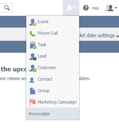
A new “Create New” menu appears to the right of the header, which is always accessible. Quickly create a new event, task or customer from here. This can also be personalised further.
The new navigation menu is larger and bolder:

Notice the ellipsis at the right end of the menu bar. It appears when the page is too narrow to display the full menu, for example when you are using NetSuite on a mobile device. The ellipsis means that more menus are available, and when you hover over it, the additional menus drop down so that you can access them without scrolling.
All of the menus expand automatically when you move your cursor over them, so the drop-down arrow has been removed. On tablets, you have to tap the tab to open the menu. The text is larger with more space between options to help you select the option you want when using a touch screen device.
Dashboards
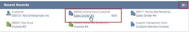
The progressive disclosure means that your dashboards look a lot less cluttered. More options appear as you hover over your portlets. For example, see below how a ‘Recent Records’ portlet changes when your cursor is in it. The menu icon appears on the right of the title bar. When your cursor is over a record, the title is underlined to show that you can click to view the record. An Edit link also appears to the right so that you can reopen the record in edit mode.
Tip: To minimise a portlet, click its title bar. To maximize it, click again.
Changes to dashboard personalisation simplify adding and removing portlets. Click the ‘Personalize’ link in the upper right to open the new ‘Personalize Dashboard’ area.
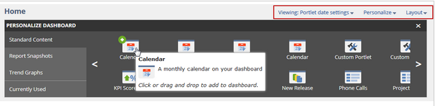
To add portlets, click Standard Content, Report Snapshots, or Trend Graphs on the left to display available portlets. Drag the portlet you want to your dashboard or click the green circle with a plus sign.
To remove portlets, click ‘Currently Used’ to display the portlets that already appear on your dashboard. When you move your cursor over the icons, the associated portlet is outlined in red on your dashboard. Click the red circle with a ‘x’ to remove the portlet. Alternatively, hover over the menu icon on the portlet itself and select ‘remove’.
Click the ‘Layout’ link to select the column layout for the current page. Bear in mind that the minimum screen width for the three-column layout is 1400 pixels.
Dashboards for the Documents and Setup pages and their related user preferences have been removed.
The ‘Quick Selector’ portlet is now the Dashboard View Filter. To open it, click the link on the upper right of the dashboard that initially says Viewing: Portlet date settings. After you select your options, the link text changes so that your selection is displayed.
‘Quick Add’ is temporarily unavailable within portlets. Add the ‘Quick Add’ portlet to your dashboard to allow you to add records, such as a new prospect, directly from the dashboard, or just use the useful “Create New” dropdown we mentioned earlier.
List Pages
All of the list controls have moved from the bottom of the list to the top. This includes the filters, which are now in a collapsible area above the list.
Everything above the list, including the column headers, remains locked in place as you scroll down the list.
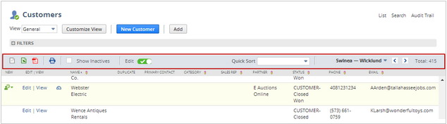
Icons for exporting and printing replace the previous buttons and appear in a toolbar above the column headers.
If additional commands are available for rows, they become visible when you hover over a row. Portlets that include lists behave the same way.
The ‘Quick Add’ row that was available with inline editing is now a ‘Quick Add’ popup window. When inline editing is on, an ‘Add’ button appears below the list title that previously included the Quick Add row. Click the button to open the popup window.
Record Pages
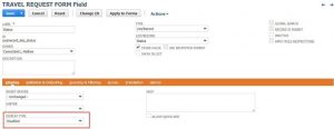
The larger font, more white space, and progressive disclosure improve the readability of record pages. Here is an example of a record in edit mode.
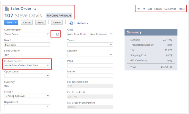
Crosslinks (List, Search, More) are now at the upper right of the page. The ‘Quick Find’ icon remains on the left side of the page to the right of the title. This can be used to search through that specific record type – the results are automatically filtered.
Note: The ‘Quick Find’ function searches for results with your search term at the beginning, it does not bring up all results that simply contain your search term. For example, if you were in a contact record, your search term would have to start with the contact’s first name – simply searching the surname will not bring up any results.
 To get around this, simply add a % at the beginning or end of your search string. So searching %Smith, for example, will bring up all contacts that include the name ‘Smith’ anywhere in the name.
Other changes of note
- Color themes – The new UI has improved colour themes in addition to the default colours. Custom colour themes are no longer supported, and the associated drop-down lists have been removed from the ‘Appearance’ subtab of the ‘Set Preferences’ page. If you had previously selected a colour theme, it has been automatically mapped to the closest new colour theme. Custom colour themes are still supported in the web store.
- NetSuite zoom preference deprecated – The zoom drop-down list has been removed from the ‘Appearance’ subtab of the ‘Set Preferences’ page. Use your browser’s zoom functions instead. The keyboard shortcuts Ctrl+plus sign and Ctrl+minus sign increase and decrease the zoom on most browsers that support NetSuite. Ctrl+0 returns to 100% zoom. If your mouse has a scroll wheel, press Ctrl and scroll up and down to change the zoom. On a Mac, use the pinch gesture on the touch pad. If you prefer the smaller font of the previous UI, try 90% zoom or smaller.
- New company general preference – Horizontal Labels enables administrators to change labels to appear to the left of fields on record pages.
- NetSuite spell checker deprecated – The NetSuite spell checker has been deprecated because it is no longer needed. All supported browsers include a feature that checks the spelling of words in most text fields, usually enabled by default.
- Added density setting for Internet Explorer – Unlike other browsers, zoom in Internet Explorer applies to all websites. To enable you to set the zoom for NetSuite independently, this new preference is provided for IE 10 and higher. It is on the ‘Appearance’ subtab of the ‘Set Preferences’ page in the ‘Styles’ group.
- Custom logo size change – The custom logo region is now 144 pixels wide and 30 pixels high. Your custom logo has been resized automatically to fit the logo region with the aspect ratio maintained.
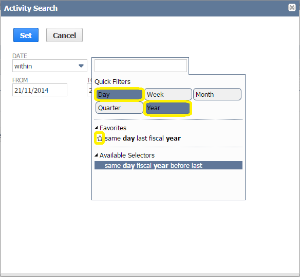
- Date ranges in saved searches – When creating a new saved search with a date range, there are now quick filters for day, week, month, quarter and year. By selecting these, you can bring up all the available selections that include that word. You can also click multiple filters to bring up results that include more than one of the words. There is a now a favourite button too, which you can click if you use certain date selections frequently. By clicking the star that appears to the left when you hover over a selection, this will add it to the favourites section at the top of the list so that you don’t have to search for it every time.
If you would like to find out more about how NetSuite works, please don’t hesitate to get in touch with our team of experts or view our other guides below.
Feel free to share this guide with your colleagues or comment below.
January – “NetSuite tips – Making search easier”
February – “NetSuite tips – Navigating through the application”
March – “NetSuite tips – Understanding the dashboards”
April – “NetSuite tips – creating custom KPIs“
May – “NetSuite tips – creating and editing KPI scorecards”
June – “NetSuite tips – how to set up email alerts“
July – “NetSuite tips – customising and sending emails from records“
August – “NetSuite tips – setting up reminders“