Over the next few months, we will be continuing to write a series of short guides for our NetSuite customers, providing them with hints and tips all designed to make their lives easier with regards to the use of NetSuite. This month’s guide is all about making it easier for users to make the most of NetSuite’s dashboards and make their everyday activities more efficient.
One of the key advantages of NetSuite over many legacy business IT technologies is its ability to bring up any real-time relevant information in a moment, which can allow anybody to access the right data to view and compare it at a glance.
But not everybody needs access to the same information, and fortunately, NetSuite is not a one-size-fits-all solution, as it can be customised and personalised by each user to fit the unique requirements of their role.
Personalise your dashboard
Every NetSuite user will have a set of dashboards relevant to their specific role. These are accessed via the tabs at the top and provide you with an overview of the information that is relevant to you. So marketing employees, for example, will have access to dashboards on their home-tab, or related to activities, leads, campaigns, and reports.
By clicking “Personalize Dashboard” in the top right, you can pick and choose which information you would like to see at a glance on each of your dashboards (tip: if you don’t have this option, it may be disabled. Discuss this with your administrator).
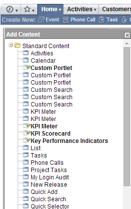
An “Add Content” box will appear on the left, and you can choose from a variety of information which may include standard content, report snapshots or trend graphs. Simply select what you would like to see and it will appear on your dashboard.
Any content you wish to remove can be done so by simply clicking the “x” on the top right of the relevant box (or “portlet”). Similarly, you can minimise each box if you want to keep your dashboard looking clean and simple. On the example below, the “cash management workbench” has been minimised.
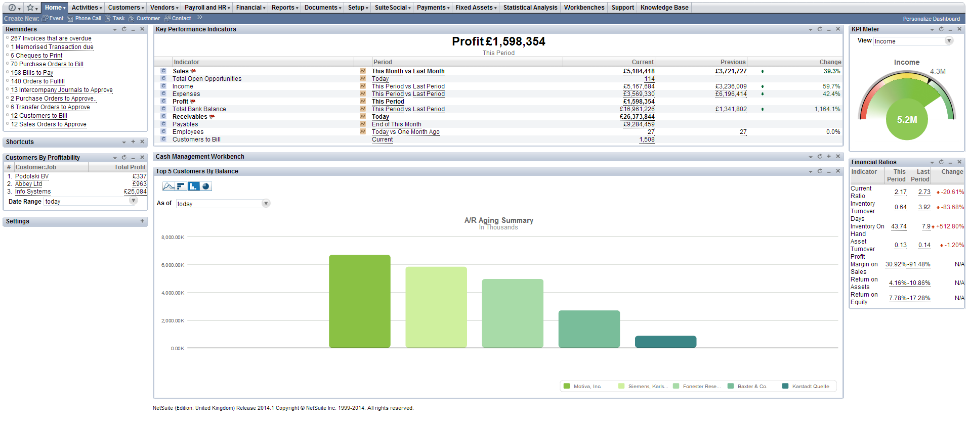
Every box can be dragged around so you can arrange your dashboard to look exactly how you want it, in a one, two or three column layout.
Select your KPIs
Being able to view the most business-critical information at a glance is one of NetSuite’s major advantages and a useful time-saver, so adding chosen key performance indicators (KPIs) to your NetSuite dashboard is a great way to improve efficiency.
The software enables you to define your own KPIs. Here’s how:
- Select “Personalize Dashboard” in the top right.
- An “Add content” box will appear on the left
- Select “Key Performance Indicators”. This will add a new box to your dashboard:

- Hover over the down arrow on the top right of the new box and click “Set Up”
- Now you can add standard KPIs, where you choose from a pre-defined list, or you can add custom KPIs, which are your pre-existing saved searches
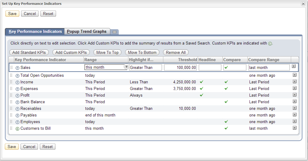
- When you have added all of your selected KPIs, click “Done”
- Set the date ranges of your choice for each KPI
- Now comes the really clever bit – set each KPI to highlight if the indicator is greater than or less than a certain threshold, and compare it to other time periods. By doing so you can easily compare your KPIs at a glance and be alerted if something is not quite right.
- Click “Save”
Tip: Want to change the date ranges for comparison? Add the “Quick date selector” portlet, which will adjust the date ranges for all your KPI’s and charts instantly (only available on the home tab).
Quickly and easily add and edit data
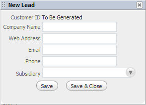
By using powerful NetSuite tools such as “Quick Add”, available on some dashboards, you can instantly add new records such as leads, opportunities, events and more directly from your dashboard, while “Quick Sort” enables you to view lists of information in the most intuitive manner.
In the tables of data on the dashboards, there is also an “edit/view” column which allows you to view and edit records with a single click, rather than navigating to the record itself.
Carry out actions directly from your dashboards
The “Quick Actions” allow you to instantly carry out an action related to the table of data you are looking at, directly from your dashboard.
For example, whilst a marketer / sales person is in the “Leads” dashboard, they can create and send a letter or email, or even make a phone call directly from the dashboard. This is done by hovering over the down arrow in the “New” column, where a list of the available actions appears.

The leads dashboard can also be used to help identify targets that haven’t been contacted in a while, so users can seamlessly undertake all key activities related to chasing up leads from the one location.
Carrying out actions in this way rather than navigating to the relevant record / report can quickly add up to a lot of time saved per day if an employee frequently needs to communicate with customers, partners or prospects.
These are just some of the many customisations and tweaks users can make to NetSuite’s dashboards to optimise them for their own use.
If you would like to find out more about personalising NetSuite, please don’t hesitate to get in touch with our team of experts.
Feel free to share this guide with your colleagues or comment below.
View our other NetSuite guides:
January – “NetSuite tips – Making search easier”
February – “NetSuite tips – Navigating through the application”
April – “NetSuite tips – Creating custom KPIs”
May – “NetSuite tips – creating and editing KPI scorecards”
June – “NetSuite tips – how to set up email alerts“
July – “NetSuite tips – customising and sending emails from records“
August – “NetSuite tips – setting up reminders“
November – “NetSuite tips: An overview of the changes to NetSuite’s user interface“