Last week, NetSuite held its fourth annual user conference, SuiteWorld. But don’t worry if you missed it – over the course of the week, we will be posting a series of short blogs designed to summarise the key developments announced at the event.
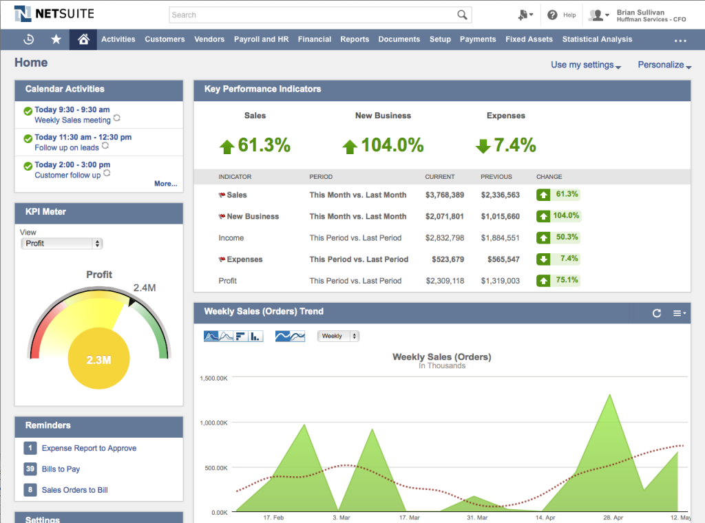
During his opening keynote on Tuesday 13th May, NetSuite’s CEO Zach Nelson unveiled the new user interface (UI) and the following day, Founder and CTO Evan Goldberg discussed and demonstrated its new capabilities.
After three years of usability research with its customers. NetSuite plans to roll out the new UI in its 2014.2 release, scheduled for Q3 2014. The new interface is designed to make it faster and easier than ever before to interact with information and will allow users to enjoy a more intuitive and visually engaging work experience.
The design supports HTML5 and has a modern “flat design,” which emphasises crispness and clarity. Functionality is combined with easy-to-read fonts, re-designed icons and graphics, increased white space and greater aesthetic simplicity.
Key changes to overall design:
- Completely new visual design across all elements of the suite.
- Responsive design, providing an improved experience on tablets. Includes larger menus and controls.
- A slim, anchored navigational header that ensures quick and easy access to navigation and tools.
- A new global QuickAdd that enables users to quickly add tasks, events, contacts, and more from anywhere in the product.
- “Progressive disclosure” that conceals action prompts until the mouse is moved over.
- A new dashboard personalisation panel that makes it easier for users to tailor the dashboard to their individual needs.
- Greater visual consistency across all pages, pop-ups and other interface elements.
Changes to dashboards:
- Responsive design to suit whichever device is used, plus improved dashboard portlet layouts, presentation and alignment of data.
- Improved look and usability of dashboard personalisation tools.
- “Progressive disclosure” of icons and actions to reduce on-screen clutter.
- Improved drag-and-drop capability for easier and intuitive personalisation of dashboard content.
- Improved presentation and layout of portlet filtering options.
Changes to record pages:
- Icon in the header to help tie icons used in recent records, history and portlets to the actual record types.
- Improved information hierarchy of record pages, with better sizing, spacing and alignment of elements.
- Enhanced look, feel and interactivity of record page controls.
- Improved legibility and spacing on record pages; labels above the fields for minimal horizontal scrolling.
- Improved table design with less horizontal page scrolling.
Changes to list pages:
- Redesigned list and search result pages focusing on usability, including filters moved to the top, “progressive disclosure” of filters, better use of space, and row highlighting.
NetSuite is running a free one hour webinar titled “Introducing NetSuite’s Bold New Look – Coming in Release 2014.2“. This is designed to take users through the features of the new interface and will take place on Tuesday 17th June at 3pm BST.
If you would like any further information about the new interface, please don’t hesitate to get in touch with one of our experts.


